A QR code review sign does not fail just because guests are unhappy. In many restaurants, the bigger issue is that the review request asks for action at the exact moment when people want the opposite. They want to finish dessert, split the check, wrap up a conversation, or head out. That is why so many owners misread the situation. They see low scan numbers and assume weak guest satisfaction. Often, the food and service were fine. The real issue is restaurant review conversion, not review sentiment.
This distinction matters. A guest can have a good experience and still ignore the sign. In fact, that is common. Satisfaction creates the possibility of a review, but it does not create momentum by itself. To get from “that was a nice meal” to “I will take out my phone, scan a code, trust the link, wait for the page to load, sign in, and write something publicly,” a restaurant has to remove multiple layers of friction. If any one of those steps feels awkward, unnecessary, slow, or slightly risky, the guest simply skips it.
That is the core answer to why QR codes fail at the table. Not because guests hate QR technology. Not because review platforms do not matter. The failure happens because the request competes with real human behavior in a dining setting. A review ask is extra work. Extra work needs timing, clarity, trust, and a reason to act now. Without those ingredients, even happy guests will do nothing.
For restaurants trying to improve customer feedback for restaurants, this is actually good news. It means low review volume is often fixable. You do not always need better food, a complete branding overhaul, or bigger discounts. Sometimes you need a better ask, a cleaner path, and fewer points of hesitation.
Where Guests Drop Off in the Table Journey
Most operators look at the last step only. Did the guest leave a review or not. That view is too blunt to be useful. A better way to diagnose low restaurant review conversion is to break the process into the small decisions a guest makes at the table.
First, they have to notice the sign. Many do not. A small acrylic stand near the ketchup bottle or tucked beside salt packets blends into table clutter. If the sign is physically present but visually invisible, the conversion problem starts before the QR code ever matters.
Second, they have to understand what the sign is asking. This sounds obvious, but plenty of signs are vague. “Scan me” tells the guest almost nothing. Scan for what. A menu. Wi Fi. Payment. Promotions. A giveaway. If the sign does not immediately explain that it leads to a review page and takes less than a minute, the guest has to spend mental energy figuring it out. Most people will not bother.
Third, they decide whether it is worth doing. This is where motivation and social context kick in. Maybe they are dining with friends and do not want to pause the conversation. Maybe they are on a date and do not want to seem distracted. Maybe they are solo, but they are already mentally moving on to the next stop in their day. Even a satisfied diner asks a silent question. Why should I do this right now.
Fourth, they have to scan successfully. This sounds trivial. It is not always trivial. The code may be too small, glossy, warped by table tents, blocked by shadows, or printed with weak contrast. Older phone cameras struggle more. Some guests still do not use QR codes comfortably. Others open the camera, see a suspicious URL preview, and stop there.
Fifth, the landing experience has to be smooth. This is where many restaurants lose the remaining high-intent guests. A bad redirect, a generic homepage, a slow page, a forced login, an app prompt, or several extra taps can kill momentum fast. When owners ask why QR codes fail, they often focus on the sign. Yet post-scan friction is just as destructive as poor visibility.
That is why the right metric is not “How many reviews did we get?” Track a simple chain instead. Estimated views. Scans. Completed review landings. Reviews submitted. Once you see where people disappear, the fix becomes much more practical.
Why QR Codes Fail in Real Dining Environments
The restaurant table is a noisy decision environment. Not noisy in the literal sense only. It is crowded with competing tasks. Guests are reading menus, talking, checking specials, watching kids, eating, paying, or packing leftovers. The QR code review sign is not entering an empty mental space. It is entering a space already full of priorities.
This is one reason table requests underperform compared with what owners expect. A diner may be open to reviewing the restaurant later, but not while still immersed in the meal. The table moment feels public. It also feels interruptive. Pulling out a phone can look rude in some social settings, especially during conversation. In a bar, the issue might be lighting and motion. In fine dining, it might be tone. In quick service, it might be speed. The friction changes by format, but it is always there.
Another overlooked factor is urgency. Review requests usually lack it. A guest knows they can leave a review later, so there is no compelling reason to act in the moment. The sign sits there asking for effort without creating a meaningful deadline or immediate relevance. That is very different from scanning a menu, where the action helps them right away. A menu QR solves a current need. A review QR mostly helps the business. Guests sense that.
There is also a privacy issue, even if it is subtle. Leaving a public review is not the same as filling out a private comment card. A review can affect a business, become visible to strangers, and remain online for a long time. Many diners hesitate because they are not sure what they want to say, or they do not want to create a public account trail tied to a casual meal. A positive dining experience does not automatically overcome that hesitation.
This is why good restaurants still struggle with customer feedback for restaurants when they rely only on a passive tabletop QR. Hospitality happens in context. Review requests do too. If the request ignores the social reality of the table, it will underperform no matter how polished the sign looks.
Visibility, Trust, and Message Friction on the Sign Itself
A lot of review signs look like they were designed from the restaurant’s perspective, not the guest’s. They are overloaded with branding, tiny print, multiple logos, and decorative clutter. Or they are too generic. A black and white QR code with “Leave us a review” can easily resemble a random ad, a sanitation notice, or something promotional that guests ignore on instinct.
Placement is the first fix. The sign should live where the eye naturally lands during a pause, not where it competes with condiments, check presenters, kids’ cups, or tabletop ads. For full-service dining, the best position is often near the check moment, but not buried inside it. For cafes and quick service, pickup counters, receipt areas, and exit zones may outperform tables entirely. If the only place you test is the table, you may be blaming QR codes for a placement problem.
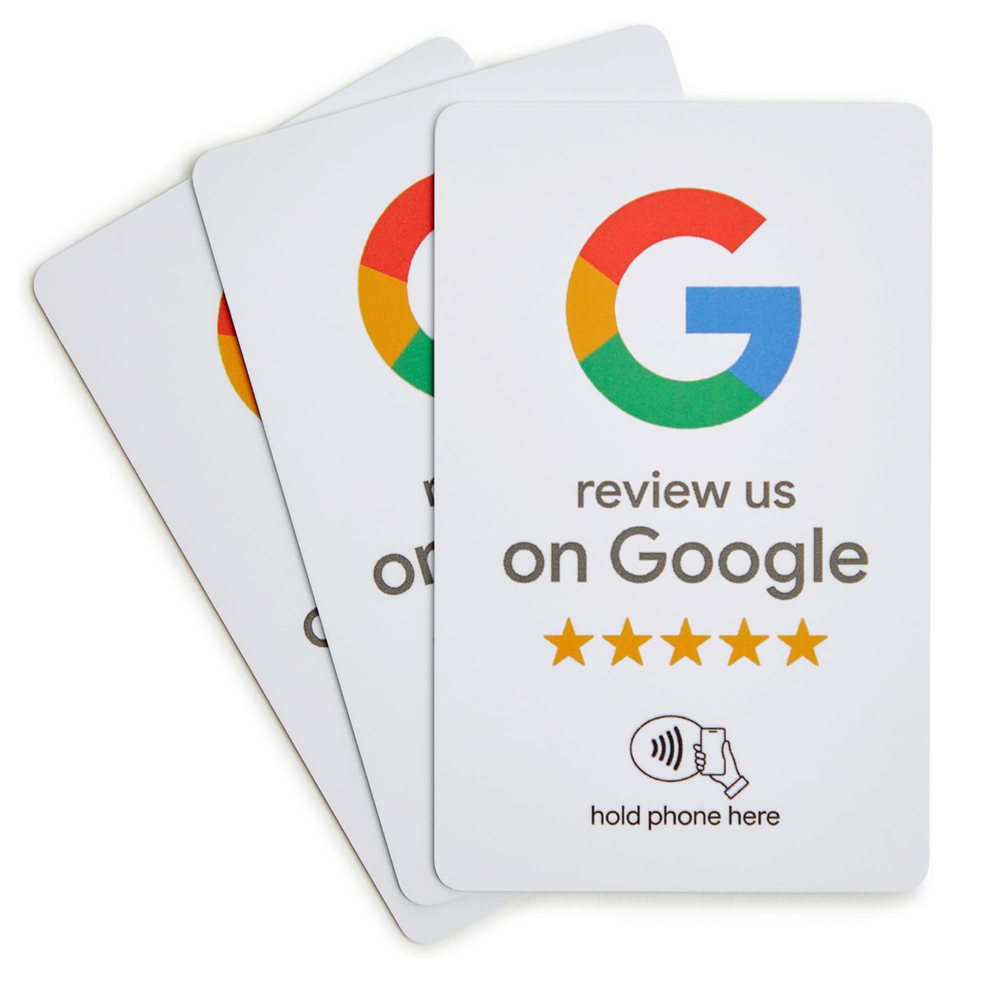
Design comes next. Make the sign look important, not decorative. Use strong contrast. Keep the QR code large enough to scan easily from a natural seated angle. Add platform cues when relevant. If the code leads to Google reviews, say that. Familiar brands reduce uncertainty. Guests trust known destinations more than mysterious links. The sign should answer three questions instantly. What is this. Where does it go. How long will it take.
The message matters more than many operators think. “Scan me” is weak because it centers the mechanic, not the value. Better copy is specific and grounded. “Loved your meal? Leave a quick Google review in under 60 seconds.” That tells the guest what happens next and frames the time cost. Even better is message copy that connects the act to hospitality. “Your honest feedback helps our small team improve and helps other diners choose with confidence.” That feels human.
Trust is the hidden conversion lever. Some guests are cautious with QR codes because scams trained them to be cautious. That caution is rational. The sign should reduce ambiguity, not increase it. If possible, show the destination in plain language. Use a branded short link as backup. Avoid sending users through strange tracking URLs. A guest should never wonder whether scanning this code exposes their phone to spam or unwanted data collection.
In other words, the physical sign is not just a container for a code. It is a micro sales page. When it fails to attract attention, explain the benefit, and reassure the guest, restaurant review conversion drops before the scan even begins.
Timing and Human Motivation Matter More Than Most Restaurants Expect
A review request can be technically perfect and still fail because it arrives at the wrong moment. Timing is one of the biggest reasons why QR codes fail in restaurants. Guests are highly sensitive to the emotional arc of the meal. Ask too early and the experience is incomplete. Ask too late and they are mentally gone.
The best time is usually right after satisfaction peaks and before exit stress begins. In full service, that may be shortly after plates are cleared and the guest has expressed positive sentiment. In a cafe, it may be after the drink is served and enjoyed, not during the order rush. In bars, it may be while the guest is settling the tab, but only if the environment still allows a quick and comfortable phone action. The point is not to choose one universal moment. The point is to match the ask to the guest’s natural pause.
Staff play a huge role here. A sign by itself is passive. A brief verbal cue from a server can dramatically increase performance because it adds social proof and context. Something simple works. “If you enjoyed everything, there’s a quick review card on the table. It goes straight to Google.” That line reduces uncertainty and makes the sign feel intentional rather than random. But it has to be used selectively and naturally. Robotic scripts hurt more than they help.
Motivation is another misunderstood area. Many owners assume happy guests should want to leave reviews. Usually they do not feel strongly enough to initiate the work. People act when the reward is clear. In reviews, the reward is not personal in the usual sense. They are helping the business, helping future customers, or expressing appreciation. Your messaging should reflect that. Gratitude-based requests outperform transactional ones because they align with the hospitality relationship.
Avoid manipulative tactics. Do not imply only five-star feedback is welcome. Do not offer sketchy incentives tied to positive reviews. Do not hide criticism channels while pushing praise channels. Those moves create legal and platform risks, and they damage trust. Better review systems ask for honest feedback and make the process easy. That attracts more credible responses, which are more valuable long term.
If you want stronger customer feedback for restaurants, build the ask around a real emotional trigger. Appreciation. Helpfulness. Community support. Pride in local business. Those are stronger than generic commands like “Review us now.”
The Post-Scan Experience Is Where Conversions Quietly Die
A surprising number of restaurants invest in table tents, print materials, and graphic design, then send guests into a terrible mobile journey. This is the silent killer of restaurant review conversion. The guest already agreed to scan. That is a meaningful sign of intent. If they still do not complete the review, the post-scan flow probably introduced avoidable friction.
The best experience is a direct deep link to the intended review destination on the platform that matters most to the business. Not the restaurant homepage. Not a “link in bio” style page with six choices. Not a survey landing page that then asks whether they would like to review publicly. If your goal is a public Google review, send them as close as possible to the Google review prompt. Each extra decision lowers completion.
Speed matters. Mobile users abandon slowly loading pages fast, especially in a restaurant where the action already feels optional. Compress assets. Remove unnecessary scripts. Test the link on average cellular service, not office Wi Fi. Many tables have weak signal zones. A page that works perfectly in the back office may perform poorly in the dining room.
Account friction is another drop-off point. If the platform requires login, you cannot eliminate that completely, but you can anticipate it. That means using the most familiar review destination for your audience and avoiding unnecessary redirects before they get there. Some restaurants ask why their code gets plenty of scans but few reviews. Often the answer is simple. Users hit the login wall and abandon.
You also need a backup path. Include a short plain-text URL beneath the QR code. If the camera has trouble or the scan fails, the guest still has a way forward. This seems minor, but minor fixes add up. Review conversion is usually won through a series of small improvements, not one dramatic redesign.
And test the exact flow yourself. Start at the table. Sit down. Hold the phone at a realistic angle. Scan under normal lighting. Use an older device. Use cellular. Count the taps. If the process feels even slightly annoying to you, it will feel worse to guests. That exercise alone answers many questions about why QR codes fail.
Staff, Channels, and Restaurant Type Change the Outcome
No review collection method works equally well across every concept. A fast casual lunch spot with heavy takeout volume does not have the same guest attention pattern as a fine dining room, a cocktail bar, or a neighborhood coffee shop. Treating the QR code review sign as a universal solution leads to mediocre results because each environment creates different barriers.
Quick service and fast casual locations often benefit more from counter signs, bag inserts, receipt links, or post-purchase text requests than tabletop cards. Guests are moving quickly. Their dwell time is shorter. Tables may not even be the core interaction point. In that setting, a review ask near pickup or right after the order can outperform a sign left on the table.
Casual dining has more opportunity, but only if staff and signage work together. Guests stay longer, which sounds helpful, but longer stays also mean more social engagement and less phone openness during the meal. The strongest moments often happen when a server recognizes positive feedback and lightly points to the review option. The sign supports the request. It should not carry the entire burden alone.
Bars and cafes face environment issues. Dim lighting, narrow tables, fast turnover, and distracted guests all reduce scan behavior. In some of these spaces, NFC tap cards can outperform QR codes because tapping feels faster and cleaner than opening a camera. Not every guest uses NFC comfortably either, but in many modern phone contexts, tap can remove one step from the action. One less step can matter a lot.
Fine dining has a brand tension. A cheap-looking acrylic review stand can undercut the atmosphere. Here the answer may be subtle review prompts delivered through the check folder, a tasteful card, or a follow-up email to reservation guests. High-end concepts often get better results when they separate the review ask from the main dining moment and preserve the tone of the experience.
Operational ownership is essential across all formats. Someone needs to own review performance. Not just marketing in theory. Not just managers “keeping an eye on it.” Assign responsibility for testing wording, checking link health, training staff on when to mention it, and reviewing scan-to-review numbers. Without ownership, low conversion gets blamed on guest behavior instead of system design.
A Practical Fix Plan for Better Customer Feedback for Restaurants
If your current tabletop sign is underperforming, do not start with a full rebrand